A teaching moment
Should we teach accessibility at our design schools?
How to design a flyer for students with disabilities.
I'm a contributor to several forums on graphic design and digital media, as well as forums on accessibility and technology. (My sneaker-clad feet are in both worlds.)
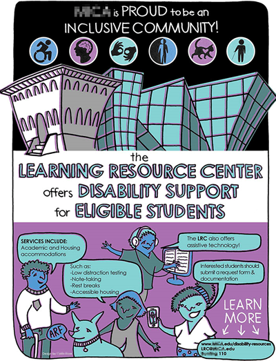
A student artist designed the flyer below for a college's LRC (learning resources center), the campus office for students with disabilities. The student asked on the forum how to make it accessible.
(Since the original graphic didn't contain any Alt-Text or Actual Text, a text transcript is below. View a full-size version here.)
Your thoughts
I have no intent to shame a great college and talented designer, so I've blurred any references to them in the graphic.
However, the flyer is a good example of how design students might not be getting all the skills they need during their studies.
What do you think? I'll update this page with relevant responses from the community.
- How could this "flyer" be made fully accessible?
- Would Alt-text on the entire graphic be sufficient?
- Why wasn't the student designer trained in accessible design in the degree program? (The college has a graphic design curriculum.)
- Why would the student services office accept and distribute this flyer to its audience (mainly students with disabilities)?
- Should design schools teach student designers about accessibility and inclusiveness?
I have my own ideas of how to correct this flyer, but I'm interested in yours because I'd like to help our design schools include accessibility and inclusiveness topics in our design curriculums.
Read some comments below from the accessibility community. Email us yours, too!
Comments from the community
From Pat R.:
I'd go back to basics: ask to see the communication plan that specifies this leaflet (who, what, when, etc.). If they don't have a plan, suggest they write one. Could well be that they don't need a leaflet at all.
[That's a great start. The college (a.k.a. the client) should define the accessibility requirements of the project in the communications plan or S.O.W./statement of work. —Bevi]
From Glen W.:
I would not use an alt text on the entire graphic because there's too much information and alt text does not convey structure and cannot be navigated word by word with a screen reader.
I would create associated semantic markup that mimics the layout of the graphic. Whether this markup is visible on the screen is up to you.
"The Learning Resource Center offers disability support for eligible students" would be an <H1> because it's the whole point of the graphic.
"[College] is proud to be an inclusive community!" doesn't feel like a heading. It's more of a statement.
"Services include" sounds like it's going to start a list so <UL> makes sense.
The "such as" feels out of place, grammatically. The list of "such as" items should probably be sub-lists under the "services includes" list. That is, "academic accommodations" is the first bullet point and sub-points under it should be "low distraction testing," "note taking," etc. "housing accommodations" is the second bullet point and should have some sub-points.
"The LRC also offers assistive technology!" sounds like it should be a third bullet point under "services include."
"Interested students should submit a request form & documentation" feels like there should be a link to take you to the forms and doc.
The "learn more" at the end would be another list.
[Glen's first paragrah says it all: Alt-text on a graphic doesn't convey enough information about the details and is difficult to use. His other points are valid, too. —Bevi]
Other notes
Alt-text can be cumbersome for users to control and navigate. Some screen readers clip the Alt-text after a couple hundred characters, so lengthy Alt-text descriptions can be "lost."
Alt-text also doesn't help those with non-vision disibilities who might have difficulty reading the hand lettering, especially the smaller text.
And Alt-text can't have hyperlinks. So the critical information about how to contact the LRC office can't be clicked by those using screen readers and other A.T. (assistive technologies). Instead, they must rely on remembering what they heard voiced by the screen readers, switch to a browser or email software, and accurately type the URL or email address. Just about everyone will have difficult doing that, whether they're using an A.T. or not.
Transcript, in lieu of Alt-text
Colorful graphic uses a cartoon-like style that appeals to college-age students. People with different disabilities are portrayed. The text is graphical and is part of the graphic itself. Most of it is hand-lettered.
[College] is proud to be an inclusive community!
The Learning Resource Center offers disability support for eligible students.
Services include: academic and housing accommodations.
Such as: low distraction testing; note-taking; rest breaks; accessible housing.
The LRC also offers assistive technology!
Interested students should submit a request form & documentation.
Learn more: www.XX.edu/disability-resources; LRC@XX.edu; [Building and room number].
PubCom specializes in accessible documents, not websites
PubCom has a full array of courses on not just Sec. 508 topics, but also traditional desktop publishing, digital media, and documents.
We started offering accessibility training in 2001, soon after Sec. 508 went into effect and WCAG 1 was released.
Our publishing and design training goes back even earlier to the Pleistocene epoch of digital publishing when Ventura Publisher and Aldus Pagemaker ruled the planet.
Summary: we know publishing, from editorial to design to distribution. And we focus on helping you maximize your technology and streamline your workflow.
Sign up for our upcoming classes or we can bring a custom curriculum to your agency that can train your writers, editors, desktop publishers, and webmasters.
We’re committed to making documents accessible for the nearly 35% of our fellow citizens who have disabilities that make it difficult for them to use computer technologies.
 We teach how to make your documents accessible.
We teach how to fish!
— Bevi Chagnon
CEO and Founder, PubCom


