
classes | services | group training | info for government agencies | map & directions | about PubCom | contact us
Fonts, Typography, and Accessibililty
Your font choices affect how computer technologies — from EPUBs to screen readers and other assistive technologies — interpret your bon mots. Here’s a brief guide to OpenType and Unicode.
By Bevi Chagnon, PubCom
December 2013
Note to those using screen readers: adjust your verbosity settings to voice punctuation and other characters in this article.
An unwanted blast from the past.
In the early years of personal computers, back when IBM and Apple computers were duking it out, a fiendish problem kept cropping up for those of us who had to take a file from one platform and use it on the other.
For example, many Word files from DOS or Windows would drop characters when opened on a Macintosh, substituting squares, smiley faces, blanks, and other rogue characters where text should have been.
The problem was that the font character encoding or “maps” used by the two platforms and the fonts were not the same.
Now that we're migrating to new media technologies and accessibility, the character problem has taken on a new twist.
Each character of a font is assigned a number. In most older PostScript and TrueType fonts, the basic Latin characters (a–z, A–Z, numbers, and common punctuation symbols which make up the “lower level” characters) were assigned the same number. But the problem cropped up when one font assigned a different number to “upper level” characters, such as accent marks, foreign language characters, mathematical symbols, and some punctuation marks.
Two different character encoding systems could use the same number for two different characters or use different numbers for the same character.
Hence, character 0175 — which represents the degree sign ° in ASCII encoding — could be who-knows-what-character in a font that doesn’t use ASCII.
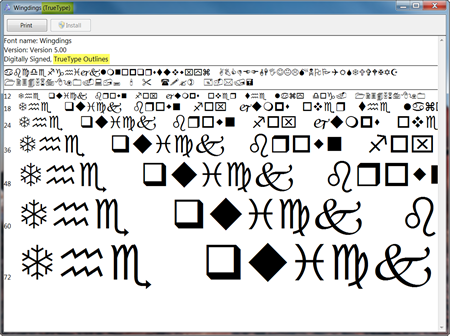
The problem is compounded when dedicated symbol or pi fonts are used. A square checkbox in Wingdings ![]() is ASCII character number 0113, which maps to a lowercase “q” in a regular text font. (In fact, the previous sentence uses a graphic of the checkbox character because HTML translated it as the letter q.)
is ASCII character number 0113, which maps to a lowercase “q” in a regular text font. (In fact, the previous sentence uses a graphic of the checkbox character because HTML translated it as the letter q.)
How this affects assistive technologies and other publishing technologies.
Imagine an unordered bulleted list with checkboxes for each list item.
Now imagine using a screen reader (or other assistive technology, AT) and hearing this:
“q First item in the list. q Second item,” and so on.
I’m sure many people with visual impairments have been confused when they heard “q” at the beginning of each list item. Human eyes see a checkbox ![]() while computer eyes see a lowercase q.
while computer eyes see a lowercase q.
And if a document with the checkbox is converted to an eBook, the checkbox could end up as a q for everyone because the Wingding font often can’t be embedded into the file. So the problem affects not only people using screen readers and other assistive technologies (AT), it affects all publishing technologies for all users, including the emerging new eBook formats such as EPUB and Kindle files.
Another example: the ” (quote marks) character. There’s a key on my keyboard, just to the left of the return/enter key, that I use to write these items:
- “Quoted material.”
- 6’2” for measurements
- 38°53’42” N 77°02’10” W for the latitude/longitude of Washington, DC (shown as degrees, minutes, seconds)
One key on the keyboard is used to represent three very different characters with meanings that are completely unrelated. Their appearance differs, too; "curly quotes" look very different from straight primes.
Modern software will convert the quote marks to “smart” open and closed curly quotes while we type, so we don’t have many problems with this usage by screen readers and publishing technologies.
But quote marks aren’t voiced to screen reader users unless users specifically control the verbosity settings in their software to do so. So 6’2” can be voiced as:
- Sixty-two
- Six Two
- Six right-tick two right-quote
None of these variations get the job done correctly. They miscommunicate the information to those using screen readers.
Solution, Part 1: Use the right fonts.
Most of the problems from character maps can be resolved by using OpenType fonts that use Unicode character encoding. Unicode has been around for several decades, but it didn’t come into the limelight until 2000 when Adobe and Microsoft jointly adopted Unicode for font encoding. Today, Unicode is the default character encoding for nearly all computer technologies.
Unicode is a common character set that is supported on the Windows, Apple, and Unix platforms. It assigns a unique number (called a code point) to each character of the world’s major languages, plus mathematical symbols, common decorative symbols like checkboxes, diacritical marks, punctuation, and other characters.
Plus, Unicode supports more than 900,000 code points which means it can handle more than 900,000 characters or glyphs. That’s a huge increase from legacy TrueType and PostScript fonts which had only 256 code points.
These 2 screen captures show a legacy PostScript version of the Minion font and a newer OpenType/Unicode version below it. The PostScript version (top) has 234 characters compared to the OpenType version (below) which has 1,659 characters, an extended character set.
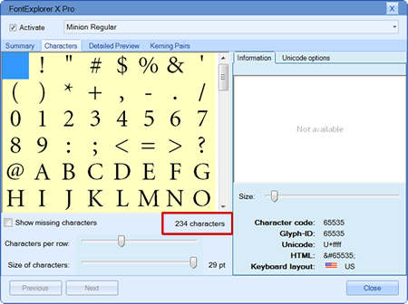
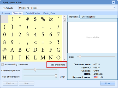
The above screen captures show font details in Linotype FontExplorer X Pro, a font management program. The same font, Minion, is shown in both its PostScript and OpenType versions. The appearance of the characters is the same, but the number of characters available for each font, their code points, is 234 in the PostScript version and 1,659 in the OpenType version.
Unicode maps every character of more than 100 languages, dialects, and symbol groups to a unique character number (code point). Even CJK fonts (Chinese, Japanese, Korean, and other Asian languages) with thousands of characters, have complete character sets in one font. See the Unicode Consortium’s website for a list of languages and character sets at http://www.unicode.org/charts/.
Solution, Part 2: Use the right character.
With Unicode, the above problem of using quote marks for measurements and navigation data is solved by using the single and double prime characters for feet, inches, minutes, and seconds and using quote marks only for quoted material:
- U 2032 = single prime ′
- U 2033 = double prime ″
- U 2019 = single closed quote ’
- U 201D = closed quote ”
Use the correct character for what it represents rather than a look-alike character. A Unicode font might have several different characters for a symbol that looks like a single quote mark, but only one of them is a true single quote. The others could be diacritical marks, accent marks, primes, and who knows what else!
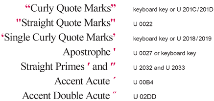
Look carefully at the above examples; not only do they have different meanings, but they also have subtle visual differences.
Another example: hyphens, en-dashes, em-dashes, and minus signs. Each has a specific grammatical use and is interpreted differently by screen readers.
- hyphen key = a hyphen that combines two fragments of a compound word or hyphenates a word at the end of a line. Most screen readers do not voice hyphens.
- U 2013 = en-dash connects two items in a series, such as 9–5, January–March, and Mon–Fri. Most screen readers will voice them as “dash”, others as “to” or “through.”
- U 2014 = em-dash indicates a change in thought within a sentence. Example: Recent computer technologies — from EPUBs to assistive technologies — require Unicode. Most screen readers do not voice em-dashes but the voicing will pause and drop in tone, much like it does for a period.
- U 2212 = minus sign which is a mathematical operator: 5 − 2 = 3. Today, most screen readers voice a minus sign as “minus.” When a hyphen is used instead, the formula might be incorrectly voiced as “52 = 3.”
Perfect, Right?
We need to keep in mind that we’re in a transitional industry. Software, regulations, techniques, and skills are evolving — and will continue to do so for the next few years. All of us are pioneers in the field, and it will be some time in the future when accessibility will become a mature technology.
Although we might have all the characters we need in an OpenType/Unicode font, that doesn’t mean the manufacturers of assistive technologies have recognized those characters in their programs. All of the screen reader software programs we’ve tested voice only the major characters, leaving others unvoiced and skipped. Sometimes the user can’t tell that he’s not hearing a character.
Which characters are voiced is controlled by the person using the assistive technology and is also dependent on the features and controls built in by the AT manufacturer.
If you’re a writer, editor, or designer, it’s your responsibility to use an OpenType font and select the correct Unicode character from it. This will build a longer shelf-life into your documents that will take advantage of Unicode while technologies catch up.
I expect that eventually, screen reader software manufacturers will increase the number of characters recognized by their programs, and as long as we create our documents with the correct Unicode characters, they will be readable when AT technologies improve.
How to Spot OpenType Fonts
All OpenType fonts are based on Unicode, so choose OpenType fonts for your documents rather than TrueType or PostScript fonts. They work in all programs, from MS Word to Adobe InDesign, and on Windows, Apple, and Unix computers.
OpenType is now the computer industry’s worldwide standard for fonts starting in 1997 when Microsoft and Adobe jointly released the OpenType standard.
By the early 2000s, Adobe finished converting its entire PostScript font library to OpenType. It no longer sells legacy PostScript versions of its fonts.
Other font foundries, such as Monotype-Linotype, Font Bureau, Bitstream, FontHaus, Elsner+Flake, P22, and URW, have followed suit but often still sell legacy PostScript and TrueType versions. I recommend purchasing only OpenType versions of their fonts.
How do you know which fonts on your computer are OpenType?
There are several ways. Remember, all OpenType fonts use the Unicode character set.
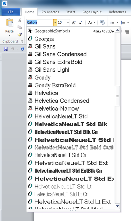
If you have a font management program, launch it to view the individual fonts on your computer. Blue-green “O” icons or the word OpenType in font descriptions indicates OpenType.
If your software program shows small icons in the font menu, look for those with blue O icons. Adobe’s Creative Suite programs, including InDesign, show icons in the menu and so does Microsoft Word.
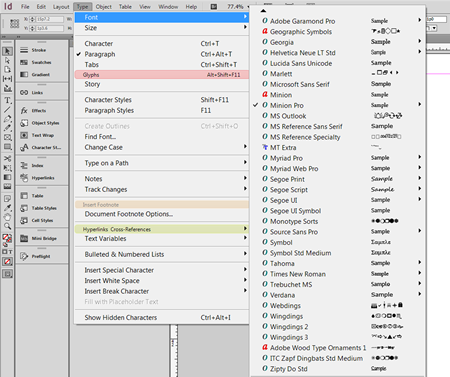
In the screen capture below, Adobe InDesign shows icons for all three font technologies: PostScript, TrueType, and OpenType.
In Word 2010 shown below, the icons aren’t as well defined. The blue O indicates OpenType, but the typewriter icon could indicate a PostScript, TrueType, or OpenType font.
Open your computer’s font folder and view the font icons and file name. Depending on your computer operating system, you might find the icons next to each file name. The blue-green O icon indicates OpenType.
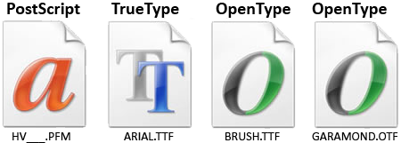
As shown above, OpenType file names can have either OTF or TTF extension at the end, so don’t go by the name only. OTF extensions indicate OpenType. However, a TTF extension could be either a legacy TrueType or a newer OpenType font, so you’ll need to examine TTF fonts more carefully to determine whether they are OpenType.
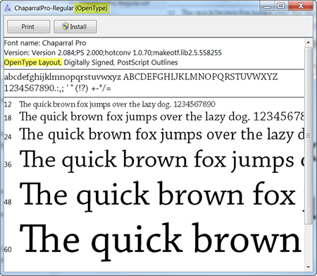
To check your fonts, double-click (Option-click) on the font file and launch its properties panel. Look for the word “OpenType.” Here are some examples:
Summary
Use OpenType fonts rather than legacy TrueType and PostScript fonts. This will allow your document to be used by multiple digital technologies as well as on different computer platforms (Apple, Windows, and Unix). OpenType also gives your document a longer shelf-life for new technologies that will be developed in the future.
- All OpenType fonts use the Unicode character set, which has more than 900,000 code points.
- OpenType fonts can have thousands of characters, including foreign language alphabets, mathematical symbols, extended punctuation, and more.
Select the correct Unicode character, such as hyphens/dashes and quotes/primes, to ensure more accurate voicing by screen readers and other technologies.
Resources
To learn more about Unicode and OpenType, visit these websites.
- http://www.typography.com/ask-hfj/opentype
- http://solutionpartners.adobe.com/ap/type/opentype/
- http://www.unicode.org/standard/WhatIsUnicode.html
- http://www.unicode.org/education
- http://www.unicode.org/charts/#symbols
- http://www.microsoft.com/typography/otspec/otover.htm
- https://www.adobe.com/products/type/opentype.html
— Bevi Chagnon
Founding Partner, PubCom
Editor: Laurie Cullen
Your Comments
These are my thoughts and experiences with font accessibility. Any from you?
Leave a comment on our Facebook or Twitter pages.
![]()
![]()
Check out our handy Unicode character chart in our online Bookstore.
It puts 103 of the most commonly used glyphs at your fingertips.
Contents, this article
- An unwanted blast from the past
- How this affects assistive technologies and other publishing technologies
- Solution, Part 1: Use the right fonts
- Solution, Part 2: Use the right character
- Perfect, right?
- How to spot OpenType fonts
- Summary
- Resources
- Your Comments (on Facebook webpage)
- RETURN to the blog's homepage
Software and Sec. 508
Only the most recent versions Adobe InDesign and Acrobat Pro have the tools to create accessible files and PDFs. My current recommendations are:
- InDesign CC exports a better, more accessible PDF than previous versions.
- Acrobat Pro DC has an updated accessibility checker and improved tools for remediating PDFs.
Learn accessibility at PubCom's 508 classes.
Live classroom or live remote/online. Accessibility for
Word | PDF | InDesign | EPUB
Census Bureau figures for 2010
54 million: Number of people who have a disability.
19%: Percentage of the civilian noninstitutionalized population that is disabled.
Source: U.S. Census Bureau News, CB10-FF.13, 20th Anniversary of Americans with Disabilities Act: July 26, 2010.