
About the Author

Where did my tools go?
What'd Adobe do with the scroll bars?
Why am I forced to make 1 or 2 more clicks to do the same task?
And why were the left-hand tools moved to the right, and the right ones moved to the left?
You might have to hunt down your familiar tools in the latest version of Adobe Acrobat, and then again you might never find them in the new user interface. So frustrating when things change without an obvious reason.
Especially when you're on a work deadline!
Here are ways you can reclaim your tools and be able to work efficiently again in Adobe Acrobat.
For the time being, Adobe lets us disable the new interface and revert back to the previous version. As far as we can tell, the “classic” interface not only looks the same as before the update, but also has the functionality and tools we expect.
The new "modern" interface, however, is missing several critical functions, and it is difficult to find utilities/tools, adjust them, or make custom tool palettes.
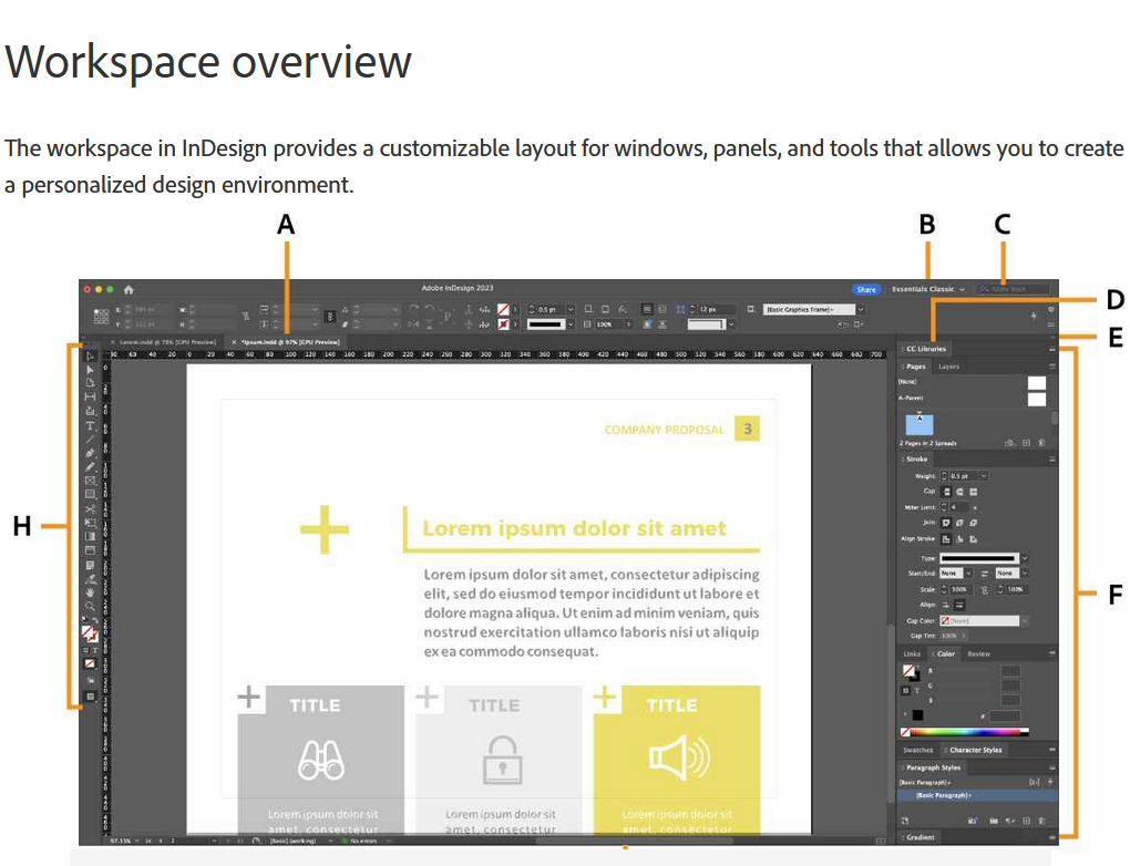
 Classic interface:
Panels can be resized, minimized, closed entirely, and expanded.
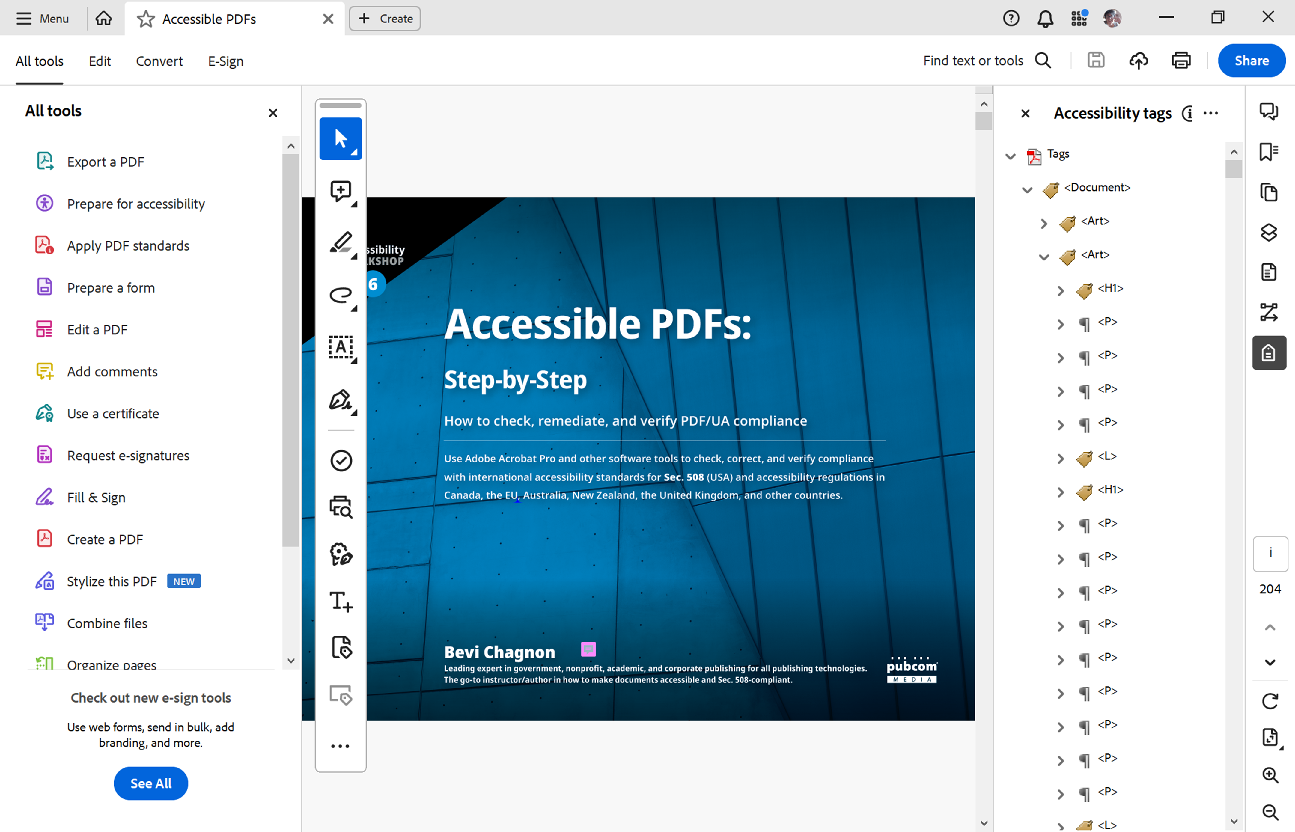 The new “modern” interface 2023/2024:
Panels are switched, left to right, and can't be resized to fit specific screen sizes. Some tools are buried deep in the panels or have been forgotten entirely.
On Windows computers:
On Macs:
And then exit out of Acrobat and reboot your computer to ensure these settings are permanent.
This has become a hard lesson for Adobe in how not to change the user interface of your company’s cash cow — especially a cash cow that is installed on +90% of the world's computers to view the most widely used document file format on the planet.
Below: A user's comment at https://community.adobe.com/t5/acrobat-discussions/trouble-with-new-adobe-acrobat-interface/td-p/14445074
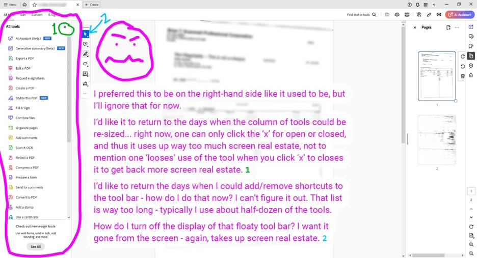 I’ve never seen so many complaints from users about the new interface on the Adobe Community forums. Thousands of users across several Adobe forums and websites have taken the time to chime in.
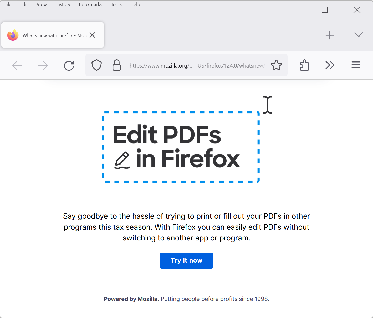
So if you launched Adobe Acrobat recently and were then baffled by what was now on your screen, you’re not alone.
The new Acrobat user interface has been slowly “rolled out” by Adobe for the past year or so, and without any warning, Acrobat will appear on your screen with the new — and dreadful — interface called Spectrum2.
It's not so much the visual "style" of the interface, but more about:
Update September 2024. With the newest update in September 2024, Adobe has adjusted some things, like finally being able to move the *&^%$#@! toolbar out of the way of the document itself, and better visible contrast of the icons.
But it's still a dysfunctional interface for those who must use Acrobat for professional on-the-job tasks. So switch back to the "classic" interface. (See above for instructions.)
Here are some comments from users. The complaints below are just the tiny tip of a giant iceberg of pain that is growing daily.
But the most thoughtful and direct comments are on another website for feedback directly to Adobe’s product development teams. See Acrobat UserVoice at https://acrobat.uservoice.com/forums/590923-acrobat-for-windows-and-mac/suggestions/47082691-ditch-the-2023-user-interface-in-acrobat
Below: Comment and vote at https://acrobat.uservoice.com/forums/590923-acrobat-for-windows-and-mac/suggestions/47082691-ditch-the-2023-user-interface-in-acrobat
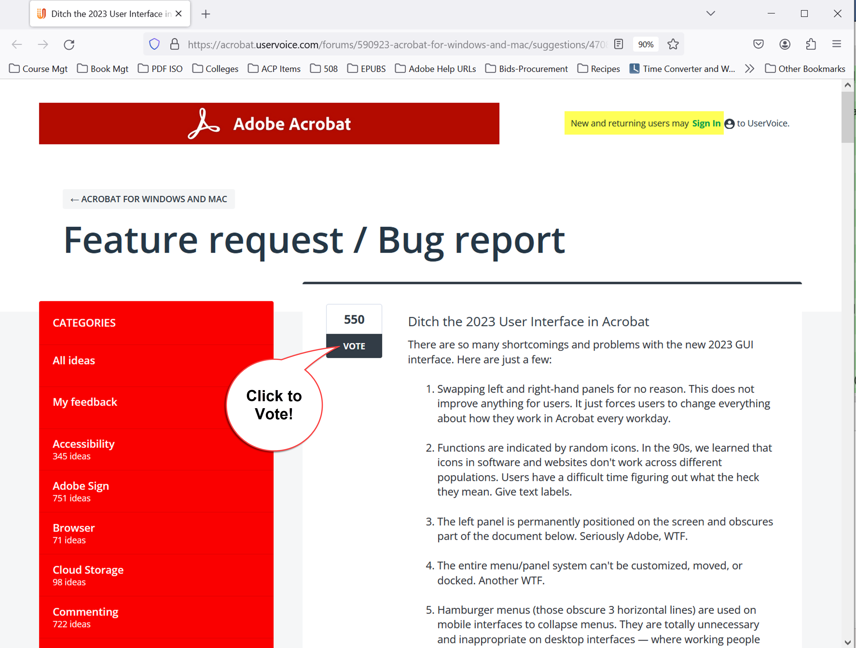 This is the place to log in, post your experience with the new interface, and Vote.
As of September 2024, nearly 800 votes had been cast against the new interface, making this post one of the most popular ones.
Personally, I think Adobe might have mis-interpreted its user data.
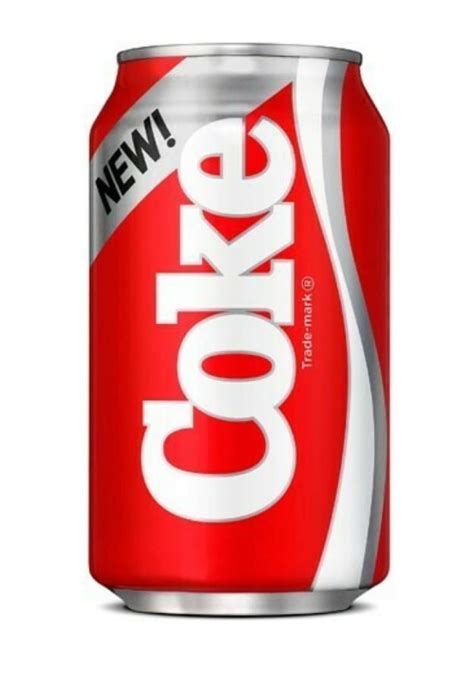 Is Acrobat the new “New Coke”? If you were around in the 1980s, you might remember New Coke. It’s a famous case often covered in MBA classes about how corporations fail with their products. https://en.wikipedia.org/wiki/New_Coke. Bottom line: First, ask your customers what they want; second, listen to them; and third, build what they want.
I’m also not convinced that Adobe corporate fully knows what its professional subscribers do with their software. In other words, they don’t understand their customers, or at least those who MUST use Acrobat to perform their job. They certainly are out of touch with their original user base that made Adobe the household name it has become:
One visitor to the forums sarcastically asked if Adobe actually uses Acrobat itself.
Makes me wonder, too.
One positive result of the revamp is that Adobe is fleshing out touchpoints and other methods for those who have touch screens on their desktop or laptop computers. (I love my Microsoft Surface tablets, which are a combo of touch-tablet and a full working computer. Been testing Adobe’s products on them for 10+ years.)
But it’s not possible to do everything with my fingertips or even a stylist pen: some tasks require a mouse, trackpad, or other traditional, precise input device. Grabbing a tiny resizing handle on a frame and stretching it smaller/larger is nearly impossible with fingers.
We recognize that Adobe has big plans for future versions of Acrobat, and we're pleased to be on their prerelease team to test new features. In the end, we'll have a much more powerful tool on our computers.
The interface redesign attempted to ease everyone into what's to come, and Adobe did clean up the icons, making them simpler, cleaner, and easier to see.
But they went overboard with the icons — now, there are just way too many icons and they lack optional text labels. Many are indecipherable.
Here's a quick test:
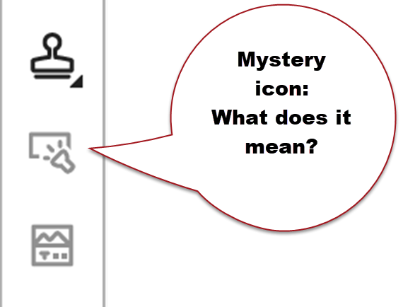
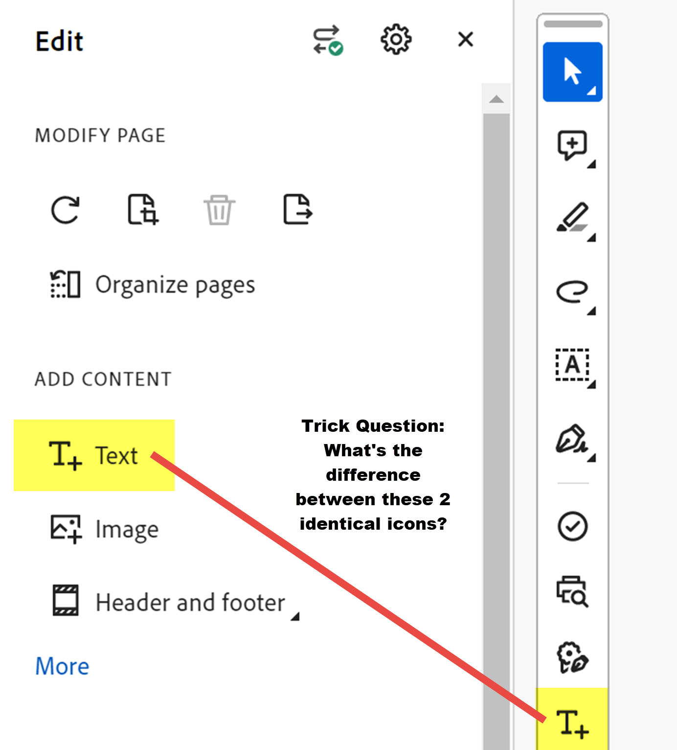
The answers to these 2 "quizzes" are at the end of this story.
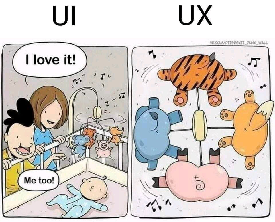
UI = User Interface, or the visual design of what we see on our screens, as well as how well it functions with different technologies, such assistive technologies for those with disabilities or when reflowed for viewing on smart phones.
UX = User Experience, which determines how easily a user can figure out the interface and do what they need to do.
I'm proud that Adobe reviews its products and makes decisions to update them. But change has to be managed well and must always give customers what they originally purchased Acrobat for.
Based on our use here at our studio and feedback on the forums, here are some features Adobe should build into a better user interface:
Adobe no longer has the monopoly on PDF viewers, editors, and readers because the PDF file format is now open-source rather than proprietary, and the ISO has published standards for creating compliant PDF files.
Customers now have other options. If you don’t need the professional tools for accessibility, printing/prepress, graphic arts, data merges, or publishing, then see if another brand of PDF editor might work for you. https://en.wikipedia.org/wiki/List_of_PDF_software
We’ve found that ABBYY Fine Reader and FoxIt have decent general tools, but please note that FoxIt is not a US corporation and might not be allowed on government computers.
 Many browsers are starting to automatically open and render PDFs. But none give full access and control, such as filling in PDF forms, editing, commenting, or accessibility.
We expect browsers will expand their PDF features in the future.
Adobe Acrobat is still the best brand to use for these tasks:
Acrobat's tools are far superior than other brands for these industries. (We periodically test other brands and so far, we can’t make a solid recommendation.)
If you must stay with Adobe Acrobat, then switch back to the “classic” interface:
We encourage you to voice your opinion directly to Adobe — and VOTE at these 2 forum pages:
We suspect that Adobe will attempt to migrate this horrible interface to the rest of the Creative Suite programs. Gah! What a nightmare that will be for those in publishing, design, and digital media.
Coincidentally, several design positions were recently posted at Adobe. Maybe you’re the next new member of Adobe’s design team who could bring some sanity to the interface overhaul. Check out their current job openings at https://adobe.wd5.myworkdayjobs.com/external_experienced
 Recognize form fields. Used during forms development to help identify areas that might become real form fields. It uses Adobe's AI that's so-so in getting it right.
In the 2 text tools below, one literally changes the real content in the PDF, while the other attaches a text comment on the page. Comments can be shown or hidden, and printed or not. And they are readable as a list in the Comments Panel.
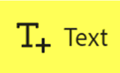 This is an editing tool to add new text to the content of the PDF, rather than layer a text comment over the content.
 This is the text comment tool. All of the PDF comment tools do not change or edit the PDF's real content. Comments are similar to sticky notes or an editor's handwritten proofreading marks on a hard copy. They're considered mark up rather than direct edits of the content.
![]()
Our services help you maximize your technology, streamline your workflow, and seamlessly build accessibility into your digital publications. Our mission is to train and coach you so well that you no longer need us or outside remediation services.
By teaching you how to fish — and make accessible PDFs right out of the box — we hope to work ourselves out of our jobs!
PubCom has a full suite of courses on accessibility topics, as well as traditional desktop publishing, digital media, and website development. We started offering accessibility training to the federal government in 2001 right after Section 508 and WCAG 1.0 went into effect in the US. That was 23+ years ago and we haven't stopped yet!
The takeaway: we know publishing, from editorial to design to distribution (print and digital) — and we're accessibility experts (Bevi Chagnon is a delegate to the ISO committee for PDF accessibility that creates the PDF/UA standard). We share our knowledge and help you learn to fish. Our little fisherman keeps us on our goal.

 Drop us a line and let us know how we can help.
Switch back to the previous interface
Helpful info and blog-a-torials are free!

![]()
We don't waste your time with puff pieces, editorial screams, or useless fluff.
Not our style.
Instead, our blogs are mini training sessions to help you master the art of publishing, design, and accessibility.

Long ago one of PubCom's editors nicknamed them blog-a-torials and the name seemed just right.
We teach. So you can do. And we hope you enjoy learning with us!
![]() Sign up for email notices when a new blog posts and be the first to know!
Sign up for email notices when a new blog posts and be the first to know!

Customer Service: 301-585-8805 or TalentedFolks@PubCom.com
PubCom is a US corporation located in the Washington DC metropolitan area. We work nationwide and around the world.
We're an SBA certified woman-owned small business. And we're 100% USA; all our employees and contractors are US citizens, and all our workbooks and products are made in the USA.

©1996 - 2025 PubCom
PubCom, PubCom Media, & Section 508 Accessibility Workshop are Trademarks of PubCom.
All rights reserved.
Your security is protected throughout our website by:
![]()