About the Author
There’s no one-size-fits-all, cookie-cutter method for writing Alt Text. Writing Alt Text is both an art and craft.
This multi-part tutorial updates best practices for Alt Text.
Prompted by revised accessibility standards, new AT (assistive technologies), and better awareness of the needs of a broader base of users, we take a new look at how we provide this critical information to everyone.
Take a minute and think about each graphic. Why is it in the document? What's its purpose? This helps you choose the best technique to convey its message.
Be concise. Eliminate unnecessary words.
But, don’t leave out the essentials. Craft the right balance.
Neither the WCAG, EPUB, nor PDF/UA accessibility standards specify a length for Alt Text. However, there’s a practical limit of how much Alt Text some assistive technologies (AT) can provide the user. Some ATs clip the Alt Text after 200-300 characters — about the length of a long Tweet. There’s also a limit to how much detail human users can “process” as well.
When necessary, use other methods to convey extensive details found in STEM graphics. For complex data charts, provide an accessible, matching data table with the graphic. It could appear after the graphic, in an appendix at the end of a document, or on a webpage. Or make available the original spreadsheet from which the data chart was created.
If possible, put as much information about the graphic in the body text before the graphic, in prefatory text, or the graphic's caption. These are available to all users, not just screen readers, and minimize the limitations of Alt Text.
Speak the Alt Text aloud and fine tune it. It should sound fluid and natural to your ears, not clipped or stilted. It's useful to test it with a screen reader, as well know how other AT will process it.
Most screen readers announce that it’s an “image” or graphic. But that might not be accurate enough for some graphics, such as logos, technical illustrations, maps, and charts. If you think that “image” doesn’t describe the information well enough, then add a term that defines it better for AT users. But keep it short. Write “Caricature of President Obama” rather than “This is a caricature drawing of President Barack Obama.”
Put punctuation at the end of the Alt Text to improve screen reader voicing. A simple period does the trick.
Don’t repeat the graphic’s caption in the Alt Text. That violates the accessibility guideline about repetitive information.
Captions and Alt Text are not the same and have different purposes. Captions are editorial: wax poetic for as long as you'd like in the caption. Draw conclusions. But Alt Text is a literal description of the important visual aspects of the graphic and should be brief.
Don’t bury details in Alt Text that aren’t available to everyone in the caption or body text. Captions are read by all users, whether or not they use AT. No one is left out. On the other hand, Alt Text is read only by those using text-to-speech AT, such as screen readers.
Don't put hyperlinks or other action-items in Alt Text because they are not clickable or functional. AT users have limited screen reader controls when hearing Alt Text
Whoever decides which graphics are inserted in the article or webpage is also responsible for writing their Alt Text. Author’s should not push this task down the foodchain. At least take a stab at it!
Write for a broad audience because Alt Text is used not just by those who are blind. Users with partial vision, failing vision, and reading disorders also depend on Alt Text (if it's available in their AT) to clarify the details of what they can partially see or have difficulty understanding.
First, winnow down your options so that it’s easier to decide how to handle the graphic’s Alt-text.
We use these 5 categories to help decide the graphic’s purpose, the detail that must be conveyed, and the amount of Alt-text to write:
Branding, such as logos and banners
Froufrou or decoration
Window-dressing and mood-setters
Critical information and STEM graphics
Buttons and interactive elements that execute an action
This multi-part tutorial shows how to write Alt-text for these different types of graphics.
Up Next
Part 2 — Branding — discusses images used for branding, such as logos, symbols, and nameplates.
H37: Using alt attributes
https://www.w3.org/WAI/WCAG21/Techniques/html/H37
G94: Providing short text alternatives
https://www.w3.org/WAI/WCAG21/Techniques/general/G94
G95: Providing short text alternatives
https://www.w3.org/WAI/WCAG21/Techniques/general/G95
SC 1.1.1 Non-text Content
https://www.w3.org/TR/UNDERSTANDING-WCAG20/text-equiv-all.html
PDF Techniques for WCAG 2.0, https://www.w3.org/TR/WCAG20-TECHS/pdf
Figures:
Figure tags shall include an alternative representation or replacement text that represents the contents marked with the Figure tag as noted in ISO 32000-1:2008, 14.7.2, Table 323.
NOTE 1 See also WCAG 2.0, Guideline 1.1.
https://www.w3.org/TR/UNDERSTANDING-WCAG20/text-equiv-all.html
Check this blog for forthcoming tutorials on writing specific types of Alt-text.
Our services help you maximize your technology, streamline your workflow, and seamlessly build accessibility into your digital publications. Our mission is to train and coach you so well that you no longer need us or outside remediation services.
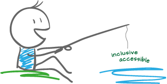
By teaching you how to fish — and make accessible PDFs right out of the box — we hope to work ourselves out of our jobs!
PubCom has a full suite of courses on accessibility topics, as well as traditional desktop publishing, digital media, and website development. We started offering accessibility training to the federal government in 2001 right after Section 508 and WCAG 1.0 went into effect in the US. That was 23+ years ago and we haven't stopped yet!
The takeaway: we know publishing, from editorial to design to distribution (print and digital) — and we're accessibility experts (Bevi Chagnon is a delegate to the ISO committee for PDF accessibility that creates the PDF/UA standard). We share our knowledge and help you learn to fish. Our little fisherman keeps us on our goal.

 Drop us a line and let us know how we can help.